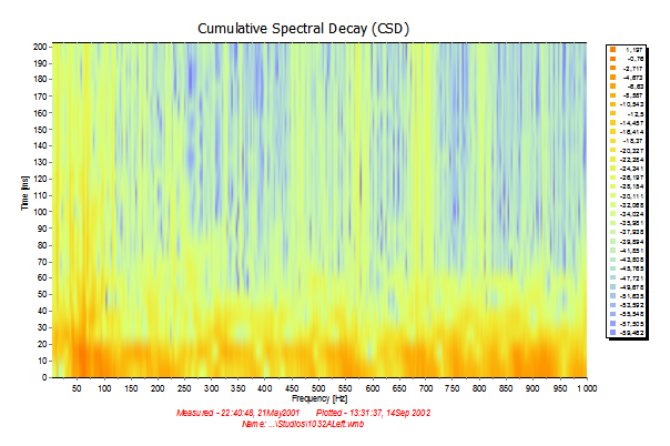
Added new layout mode Spectrogram (ColorGrid). With this mode it is only possible to view the frequency axis as linear and without smoothing. If not, the result will be wrong.
But this is useful for viewing low-frequency data, e.g. when looking for standing waves.
Note: The vertical axis is the time axis and the horizontal axis is the frequency axis. The level is given by the color only, indicated in the legend list.
To plot the data without using smoothing (it reduces the number of data points and we cannot plot more than 2000 points), select a portion of the data that you want to plot in Plot->Layout->Advanced.... In the plot above, only the first 1000 points were plotted which is sufficient for the low frequency range.